Check out our brand evolution over the past 70 years, from simple starter-mark to snazzy dimensional P with lighting and shadows. You can see how each logo is influenced by the trends of that particular era as a statement of cultural relevance.
Here’s a recap of where we’ve been and some of the thinking behind each mark.
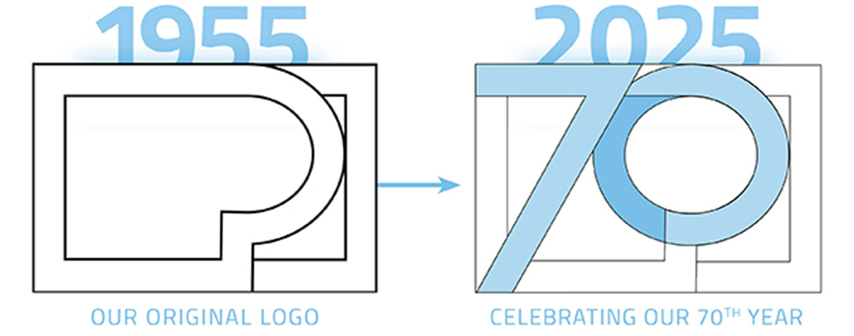
1955 – Minimalist lines
Our introductory logo had an Etch-a-Sketch vibe, even though the mark was created four years before the toy was invented. It feels reminiscent of blueprints, as if drawn using the drafting tools of the trade in this time period of booming economic growth.
Its boxy outer shape reflected the functionality of our 1950s product line, a nod to the utilitarian, frill-free extrusions we manufactured at that time. In contrast, the rounded shape of the P mimics the era’s ubiquitous fluorescent tubes.
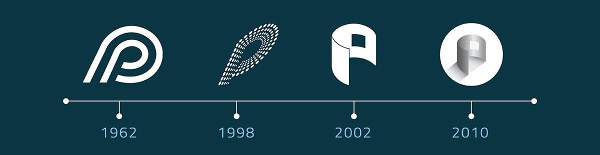
1962 – Slanted swoop
We rolled out iconic version two years into the Kennedy administration, as bright orange Tang graced America’s breakfast tables and all eyes were on the space race. Those heavy strokes and slanted swoop we now call “retro” were all the rage back then.
This mark had some serious staying power, holding its own through Woodstock, the Civil Rights movement, the Vietnam years, Studio 54, the pinstriped Gordon Gekko era, women’s shoulder pads, and gyrating 80s hair bands. (Fun fact: this throwback version is still on our packaging boxes!)
1993 – Marquee effect
In the early 90s, the World Wide Web worked its way into the mainstream, with the now-nostalgic sound of the “dial-up.” That newfound digital access prompted electronic connectivity like we’d never seen before. Against this backdrop, a glitzier logo emerged, bringing some razzle-dazzle to our humble first initial.
With this version, we leaned further into the idea of lighting, with a slightly dimensional P made up of lines of light. The series of “bulbs” suggested longevity, and an increasingly bright future for the company, despite the economic dip the country was facing.
2002 – Sleek and stylized
Inspired by the exploded view approach to technical illustrations, which dimensionalized the components, we focused on a cross-section of the metal extrusions we create daily at our plant right here in LA.
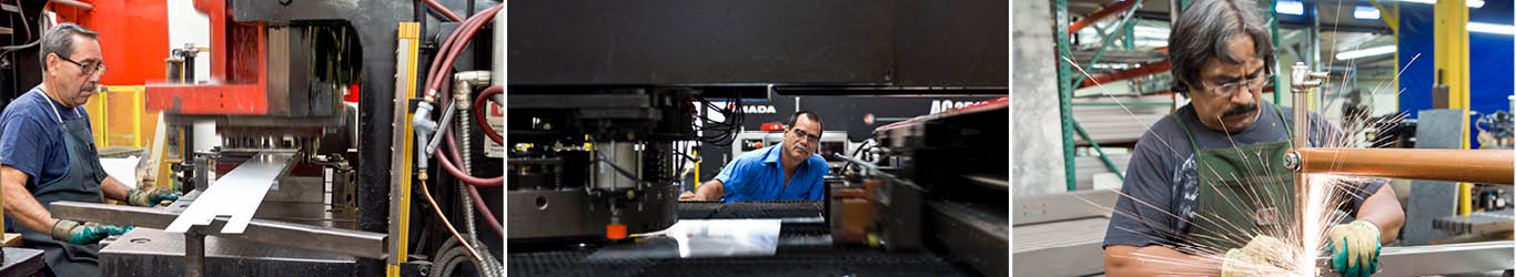
The mark’s overt focus on manufacturing is no accident, as US fabrication is a significant point of difference for us. We take great pride in complying with the Build America, Buy America Act (BABAA), and providing steady employment and generous benefits for our team.
2015 – Mood lighting
To better convey our new strides in innovation, we evolved the metal housing P, adding a dramatic flair with lighting and shadows. The timing coincided with the emergence of LED, and transformation of the entire industry.
The mark has served us well, as we continue to roll out additional advances in fixture styles, distribution, tunable features and “Light as Art.”
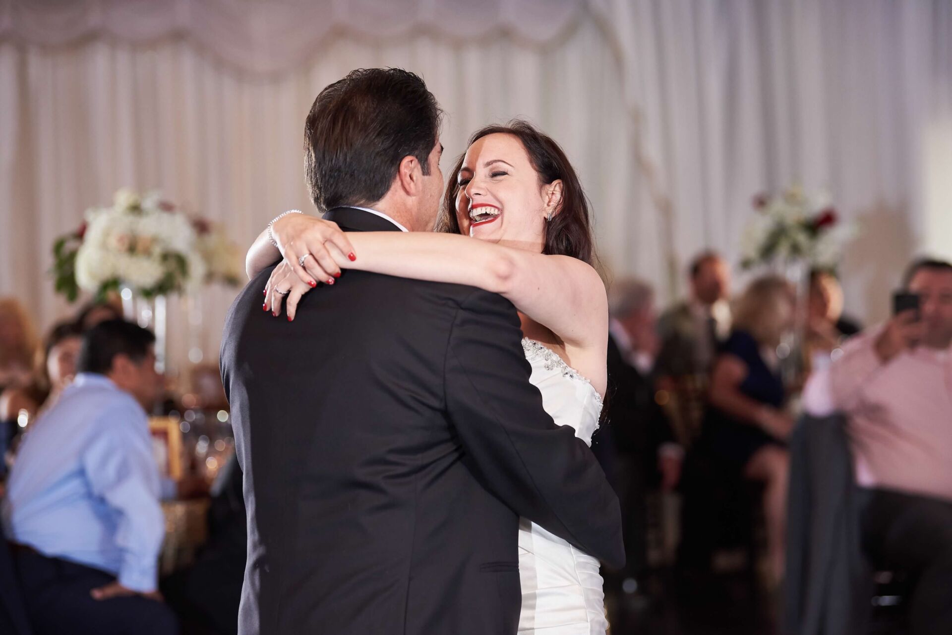
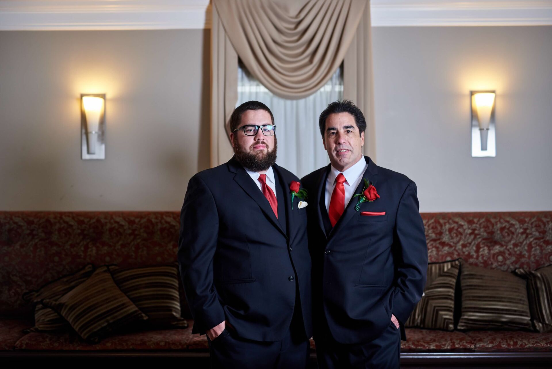
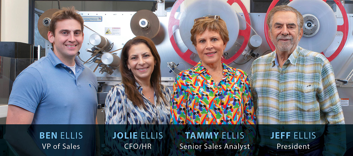
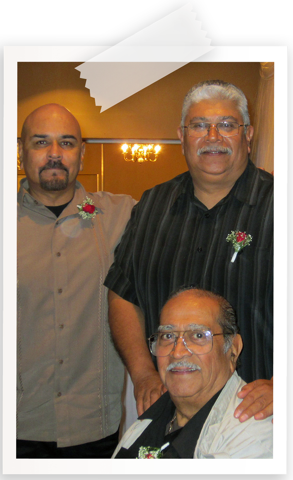 Joe Holguin joined Prudential Lighting in 1955, with the distinction of being the 2nd employee in our founding year. He led our CL (Custom) fixture department for not just years, but multiple decades. His sons, Mike and Steve, came to work with us as well, in a roundabout way. Ironically, they were employed at a nearby competitor in the 80s, where (even more ironically) Jeff Ellis – yep, our Jeff Ellis – was working. Rumor has it he needed a break from working with his dad. The upside is seeing how others do things. For better or worse, there’s learning to be had and experience to be gained. Mike and Steve made such a positive impression on Jeff, that what he decided to come back to PRU, he brought them along with him.